Sommaire
Slow design: nature takes a seat at the table
Well-being, gentleness and serenity are the key words that sum up this trend inspired by the Scandinavian and Japanese lifestyles. With slow design, nature takes a seat at the dining table. But it is much more than a decorative style, it is above all a new way of thinking about interior design. It is part of an ethical approach that is respectful of the environment and that revolves around the human being. Choosing slow design means adopting responsible consumption habits, encouraging sustainable development and favouring traditional craftsmanship: in short, a return to the authentic, simple things in life.
Natural materials are given pride of place in the dining room: unprocessed wood, stone, woven straw, rattan, ceramics or linen, a mixture of delicate textures, worked with subtlety and never jarring. Naturally, these materials are certified fair trade and carbon neutral. They create a cosy, rustic and poetic atmosphere: a real haven of peace where you can spend intimate moments with your family. The result is rough and plush at the same time.
In terms of layout, there is less clutter. The space is cleared of superfluous elements to highlight only the statement pieces. The palette is composed of neutral colours: cream, beige, brown, honey, pale pink. Details in copper or brass are brought in to add peps to the decoration and warmth to the dining area.
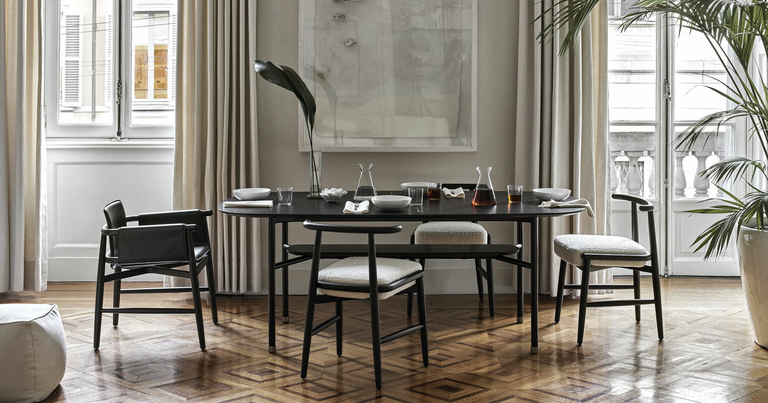
The key feature of the natural dining room? A wooden table that is roughly hewn and that follows the original line and curves of the tree. These slightly irregular shapes add a wild touch, bringing the outside in. The Tweed dining table by Italian furniture maker Zanotta, made of natural oak and cut in the shape of a leaf, is another perfect example of the sophisticated character of slow design. The white or rattan chair around the table further reinforces the pared down and simple style. A cane sideboard and a suspension made of woven fibres contribute the final touch to the look. The furniture is adorned with green plants and ceramic vases in which elegant dried flowers are placed.
Slow design is all about taking time out from the world around a meal.
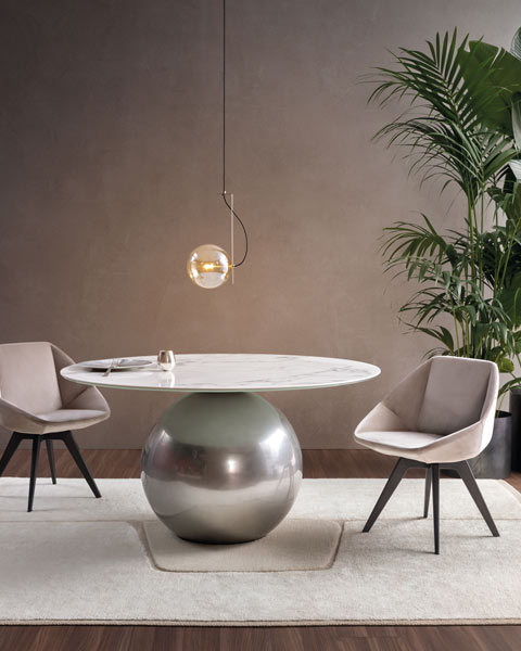
Bonaldo
The vintage trend: the art of combining past and present
The vintage trend pays tribute to the style of the 1950s, characterised by acid colours and enveloping shapes; harks back to the 1970s, when pop culture shaped interiors; or takes the lead from the 1980s, which paved the way for postmodernism.
More than ever, the vintage style is making a statement in our interiors, especially in our dining rooms. This nostalgic craze for all things vintage can be explained by a need to return to our roots, back to the good old days. It also picks on our need to recycle, our yearning to give a second life to objects and to consume responsibly. Faded glory and old-fashioned charm are making quite a comeback. Numerous manufacturers have cottoned on to this trend by offering reissues of iconic pieces.
The marriage of vintage and modernity offers a striking contrast and injects real soul into a room. To combine past and present, the secret is to mismatch with great care, without going overboard. The space is dotted with a savvy mix of bric a brac and contemporary pieces: vintage lighting such as the Panthella table lamp by Louis Poulsen, which is made up of a half-globe and a trumpet-shaped base, as well as contemporary objects such as the brass candlestick by Fritz Hansen.
The dining area is highlighted by using warm, aged and soft colours such as terracotta, ochre, fir green and sandy beige, for example. A colourful, geometric wallpaper on one wall is a good way of introducing the plush vibes of yesteryear. Touches of velvet, leather, marble, brass or tweed accentuate the retro look.
The furniture meets functional needs while retaining its vintage look by opting for rounded shapes. The yellow Gaia arm chairs from KFF, designed by Monica Armani, are a perfect example. The same goes for the retro Tonietta chairs, with a semicircular backrest and slim leg, designed in 1985 by Enzo Mari and awarded a prestigious prize in 1987. This famous model has been reissued by Zanotta. A rectangular table holding an array of bowls and a wooden sideboard underline the antique look to perfection.
Cleverly put together, the vintage style in the dining room oozes charm and offers a subtle journey back in time.
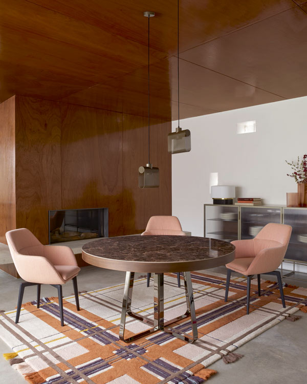
Cinna
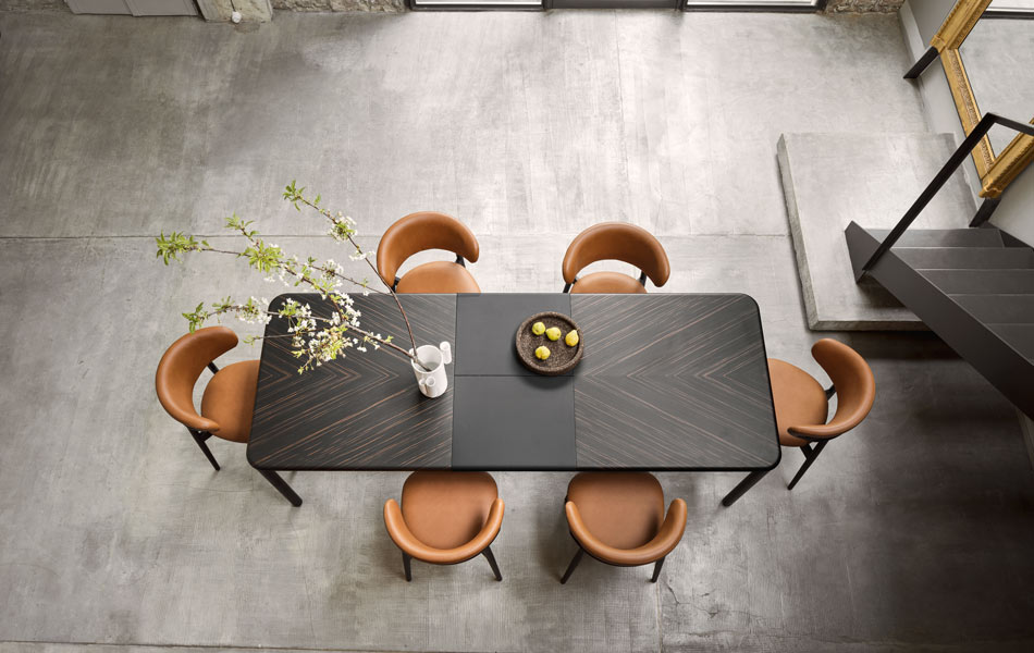
Tavolo Spiga | Calligaris
The maximalist style: the designer dining room goes for bold
The maximalist style is about being as original as possible. Combining, mixing, collecting and displaying are the precepts of a trend that may be surprising yet infinitely fascinating. Going against the grain of minimalism, this decoration leaves a broad margin of manoeuvre for audacity. The world is your oyster. In a museum-like atmosphere, the dining room is packed with a host of carefully chosen objects: crockery, vases, candleholders, sculptures, plants, frames… A masterful mix and match. Sometimes unexpected, the eclecticism somehow works, imbuing meaning and life to this space that hosts pleasant meals with family and friends. From floor to ceiling, the devil is in the detail, the style in the mix, and, abracadabra, the room comes alive. An original, unique and personalised interior design.
When it comes to colours, the sky is your limit: you can paint one wall in a light colour, another in a darker shade to create contrast, but the mix must be vibrant. The palette does not have to be bright, it can be neutral and still have plenty of detail. A wall mural is also a great way of giving character to the room. Zesty, abstract or flowery patterns really bring the space alive, while graphic or tiled floors offer a complex and interesting aesthetic result.
In a maximalist design dining room, the details are extremely important. Although the decoration is a mixture of styles, colours and materials, it must give the impression of having found its place instinctively. Every object fits in with the eccentric atmosphere. The room becomes a cabinet of curiosities and tells its fascinating story.
In the centre of the room, the table also asserts its strong identity. It can be sober to counterbalance this unique style, as is the case for the Saarinen dining table by Knoll and designed by Eero Saarinen, a timeless and elegant model with its tulip-like shape. It can also be extravagant, in line with the precepts of maximalism. Similarly, the chairs can be simple or mismatched: neutral wooden seats combined with colourful and extravagant shapes. An accumulation of oval glass luminaries of different sizes sets off the exaggerated attitude to perfection.
Undeniably original and atypical, the maximalist trend is a perfect choice for this room, which is one of the centrepieces of the home.
Whether the dining area is open to the kitchen, communicates with the living room or is a dedicated space, it can take the lead from any of these three trends.
