Completely renovated by architect Bruno Tarsia, the contemporary vibe of this apartment is offset by a spectrum of half-tone hues.
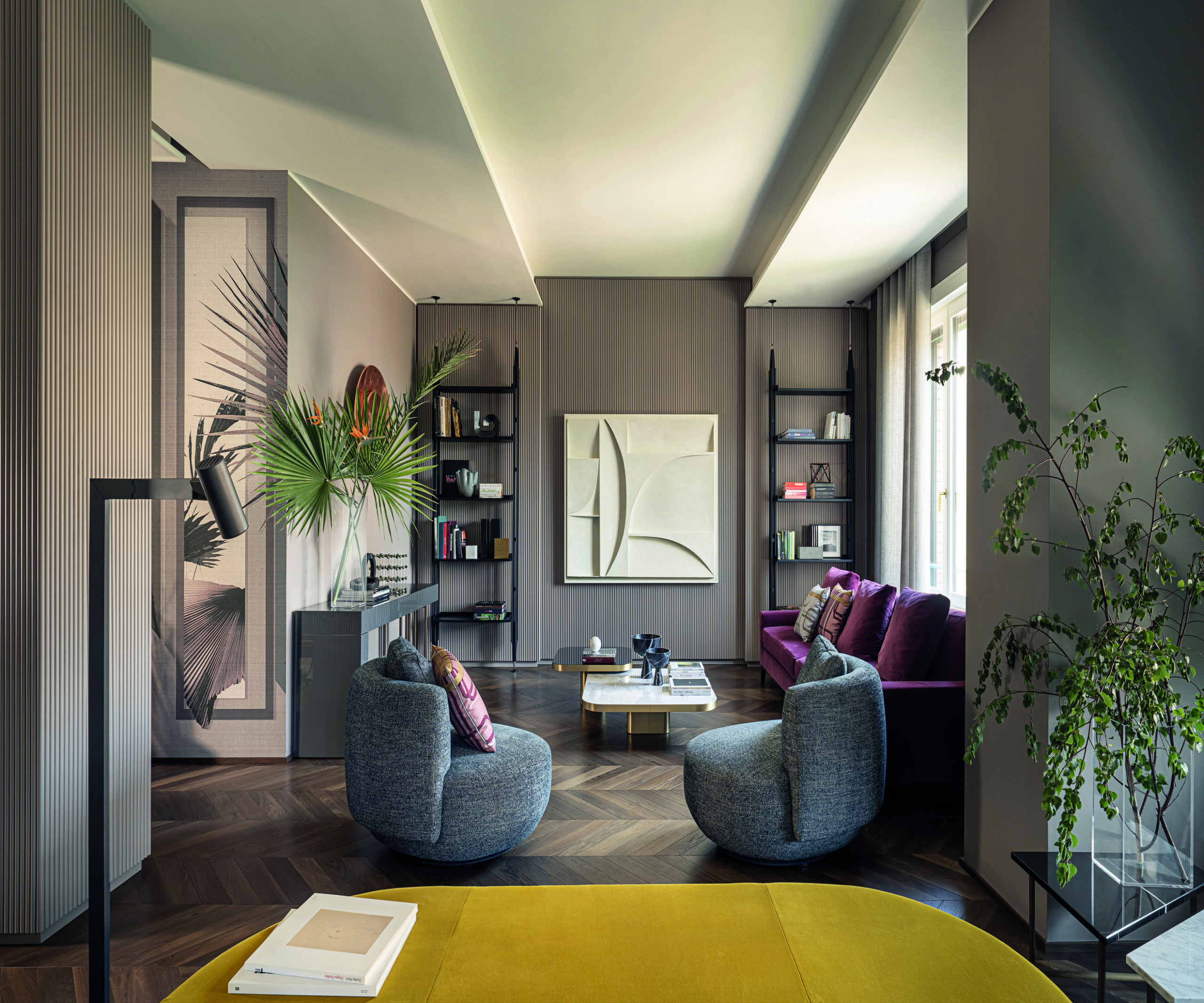
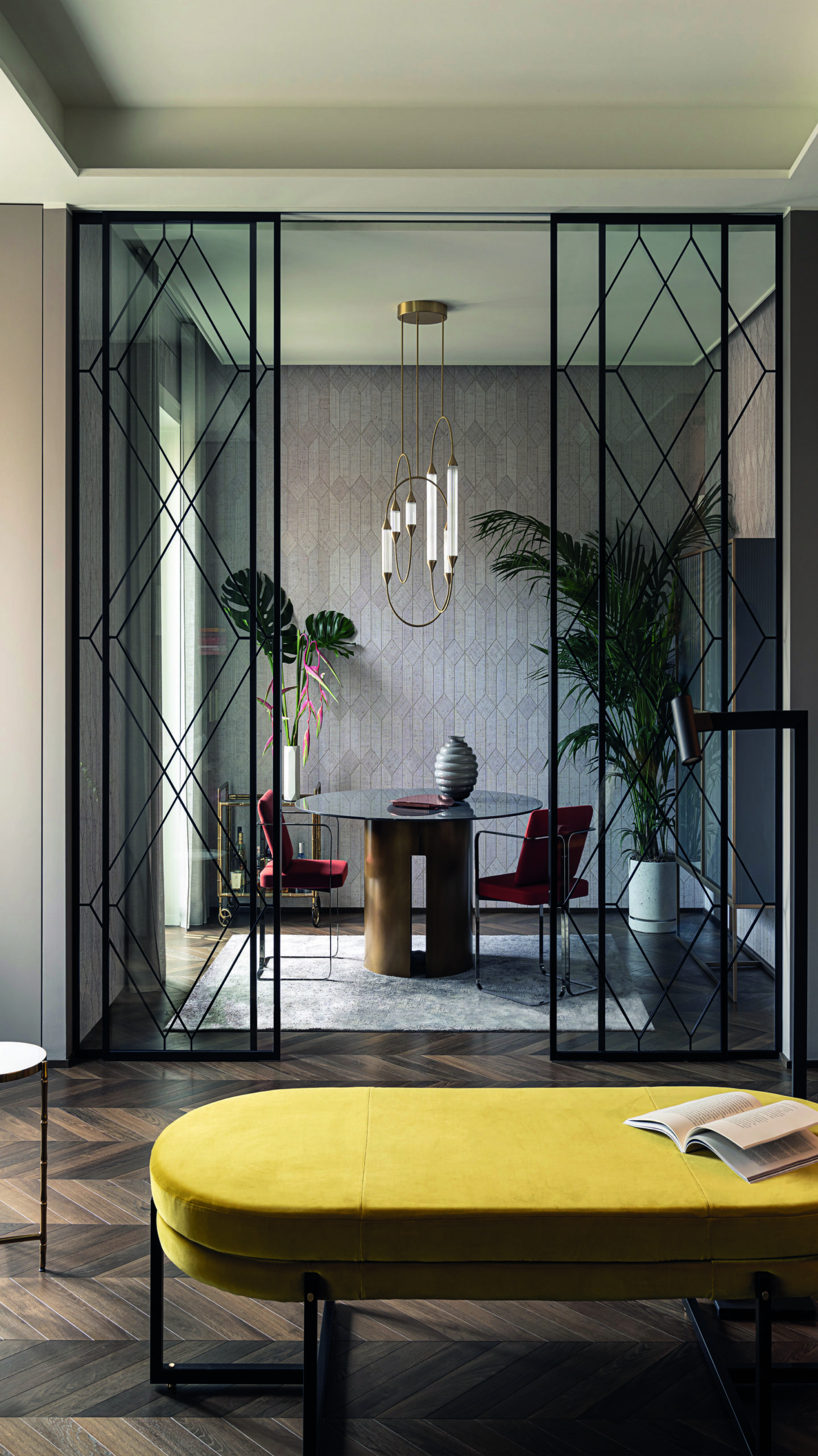
Nestling in a building dating from the 1930s, this space at the heart of Milan’s Repubblica district has been given a complete facelift by combining refined elegance with surprising aesthetic touches. Its personality has come to life thanks to the use of sophisticated materials, the integration of bespoke furnishings, combined with masterpieces of design, the application of well-mastered finishes and luxurious details. Behind its sliding glass doors (our photo), the dining room features the sculptural Gong table (designed by Andrea Parisi, Meridiani), overhung by the Cirque Chandelier Pivot suspension lamp (Giopato & Coombes) and surrounded by Murena chairs (designed by Lazzarini & Pickering, Marta Sala Éditions). In the foreground, the strikingly unexpected Sigmund bench (designed by Studio Asaï, Arflex) adds a touch of colour.
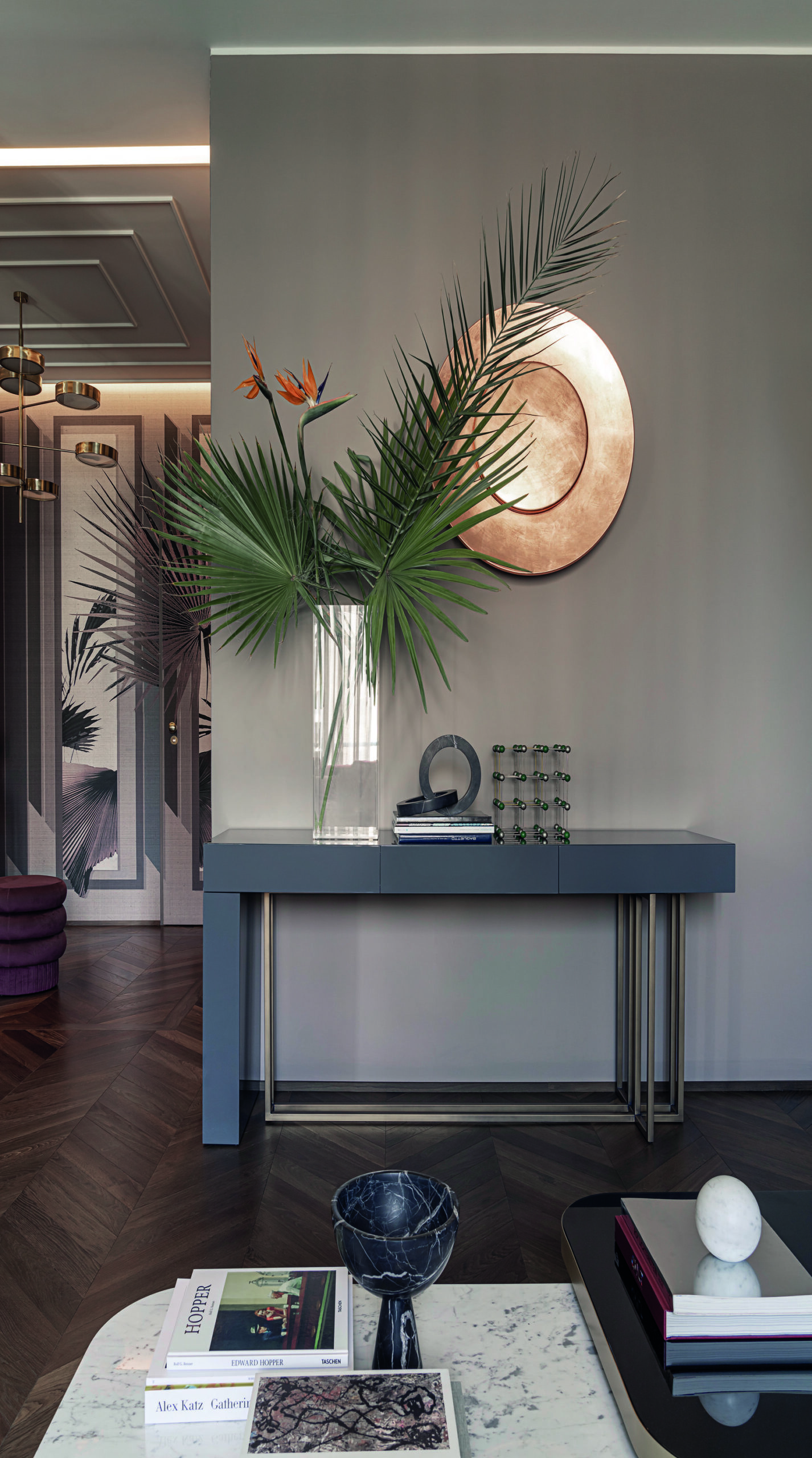
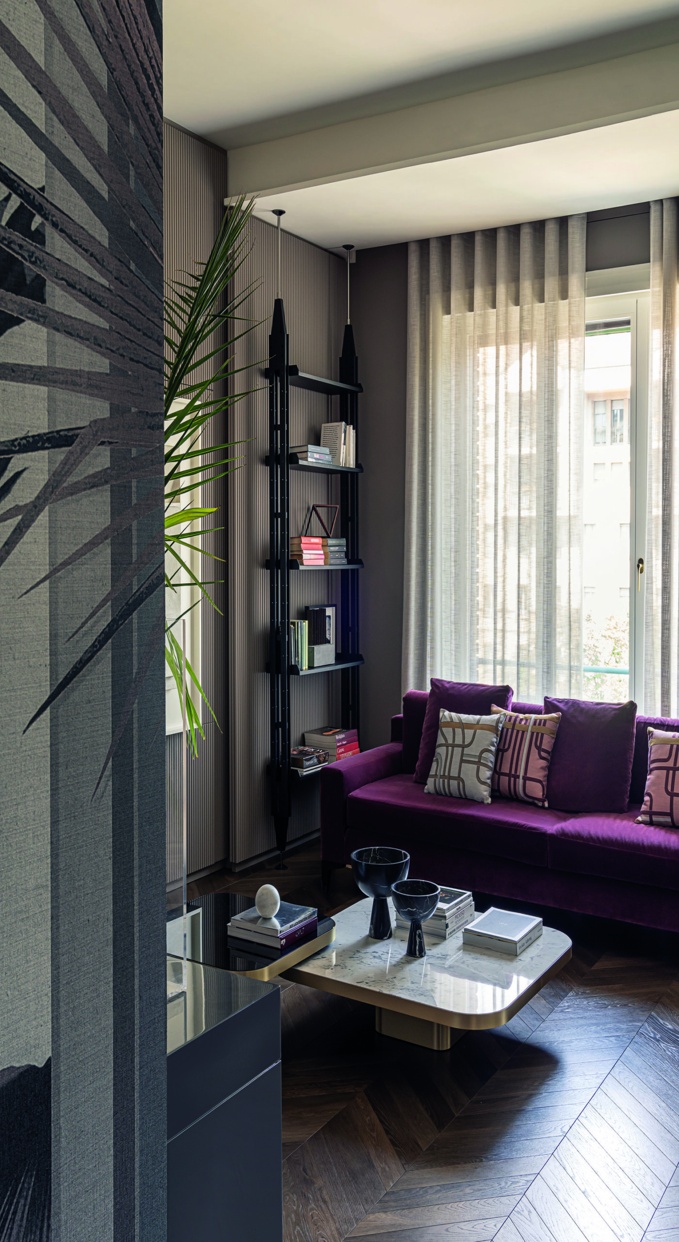
The living room has been furnished in part with bespoke pieces, mixed and matched with must-have creations from major furniture manufacturers: a sofa by Meridiani, a pair of armchairs by Gallotti & Radice, an Infinito bookcase (designed by Franco Albini and Franca Helg, Cassina), a daybed by Arflex, lamps by Giopato & Coombes and the marble-topped Bow Coffee coffee table (designed by Guilherme Torres, ClassiCon). These designer creations have been rigorously selected to work together harmoniously. The Prince sofa (designed by Andrea Parisio, Meridiani), complete with plush fabric cushions (Les Intrigues model, designed by Bruno Tarsia, l’Opificio), creates a convivial and comfortable nook. The fluted wall panels dialogue with the herringbone pattern of the oak parquet flooring, exuding a subtle elegance typical of Milan!
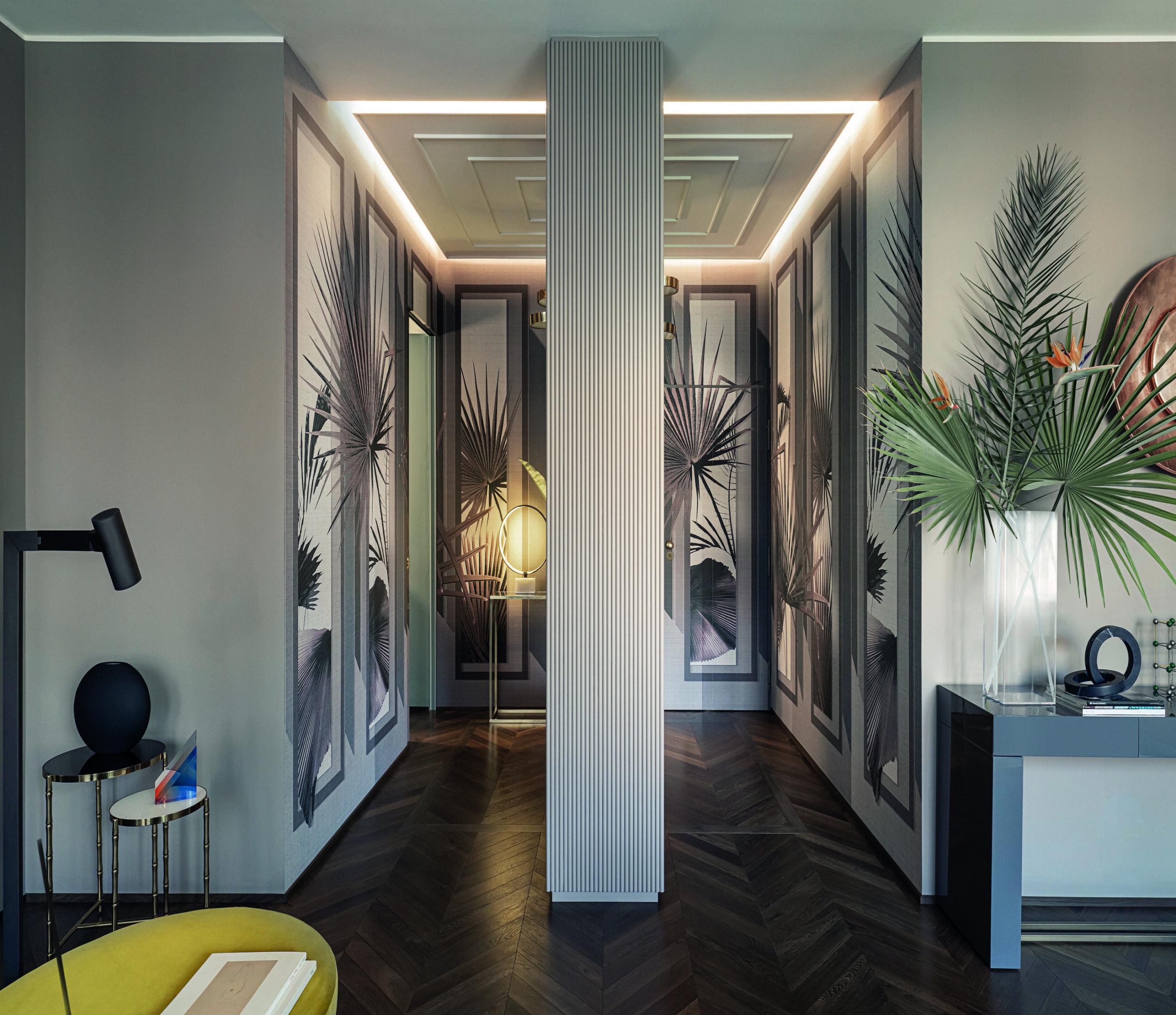
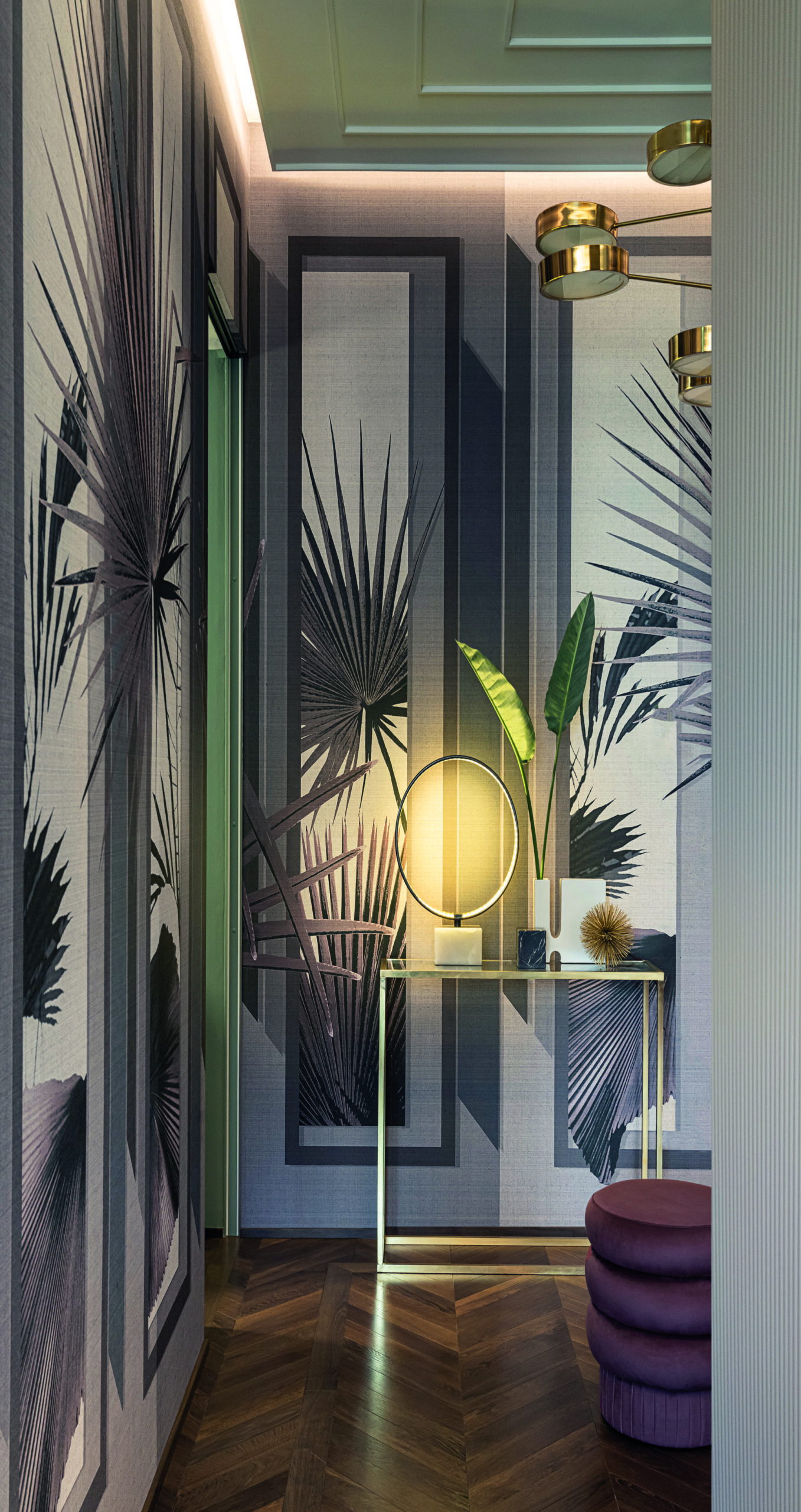
The communicating areas have been overhauled so that they no longer play the role of mere secondary passageways. They have been remodelled to accentuate the fluidity of the space and transform them into fully-fledged living spaces, fitted out with storage and lighting to compensate for the lack of natural light. “The entrance hall, a volume often neglected or considered superfluous, has been preserved and arranged to become a key element of circulation, articulating and linking all the other rooms. With its strategic position, it has become the focal point where all the spaces converge,” explains Bruno Tarsia, who was eager to achieve coherence and balance between the apartment’s different living areas. The walls of the large entrance hall are covered with Front View wallpaper (designed by Bruno Tarsia, Londonart). This space leads directly to the night area, naturally and intuitively leading the occupants’ footsteps towards the rest and relaxation zone. The spacious corridor, concealing large closets with the illusion of a mirror effect, serves as a promise of what lies ahead in the large, gleaming dressing room and the master bedroom.
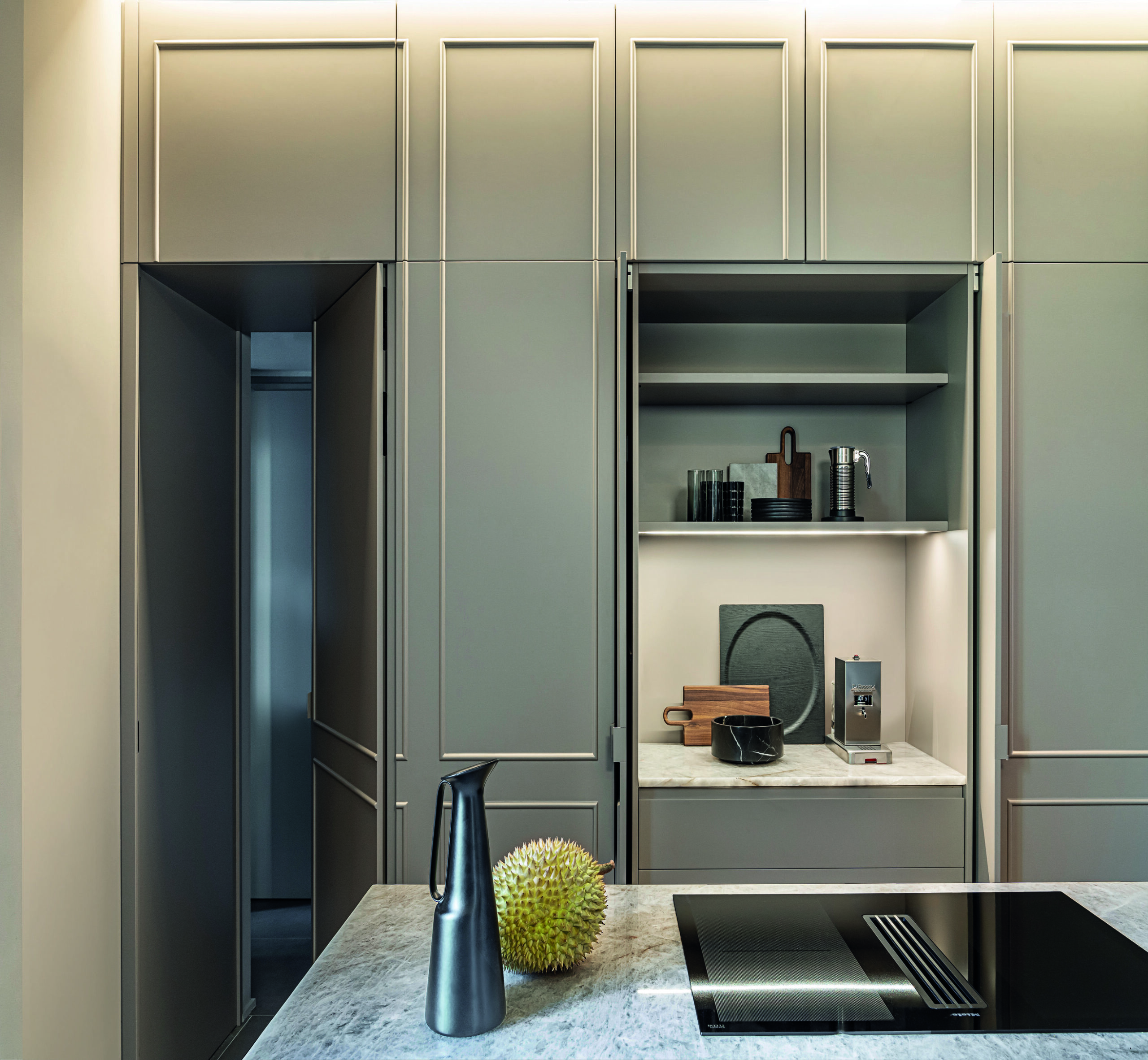
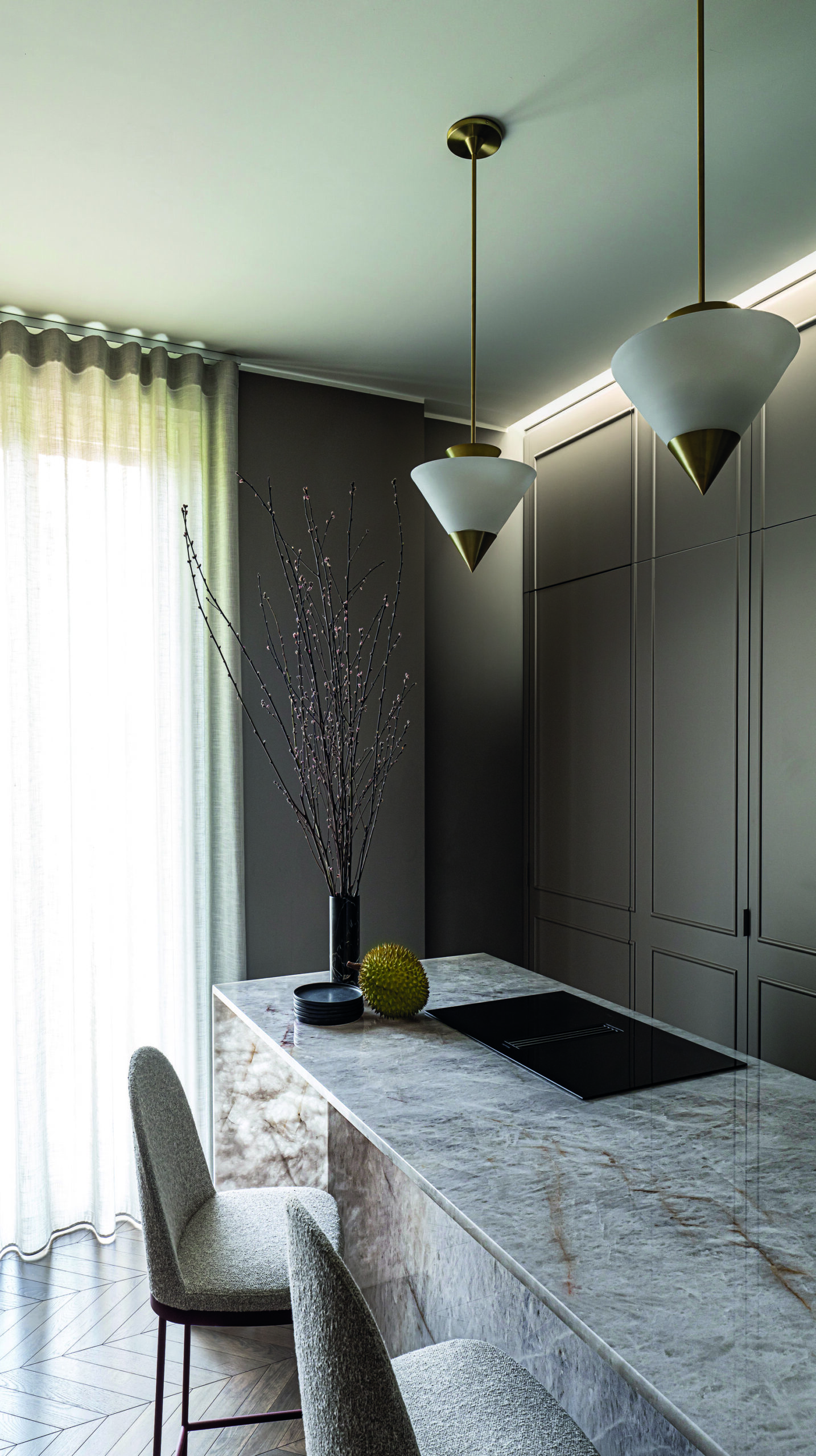
The kitchen was designed by Bruno Tarsia himself. It features an ingenious system of wall-mounted cupboards, integrated into wood panelling and concealing a highly functional space. Its retractable doors do not clutter the sleek effect, while ensuring a place for everything and everything in its place. The quartz worktop adds a mineral touch to the environment while the induction hob (Miele) is discreetly fitted flush with it. The space is illuminated by Zé pendant lights, inspired by Art Deco geometry (created by Atelier de Troupe). In this kitchen, which seems to strive to be everything but classic, the stools with their upholstered seat and backrest (Precius model, designed by Johannes Torpe, Moroso) make a statement with their minimalist, graceful base in painted steel. In terms of colour, a restful monochrome of neutral tones – beige, ecru, greige, off-white – gently envelops the space, which is bathed in natural light streaming in from a large window.
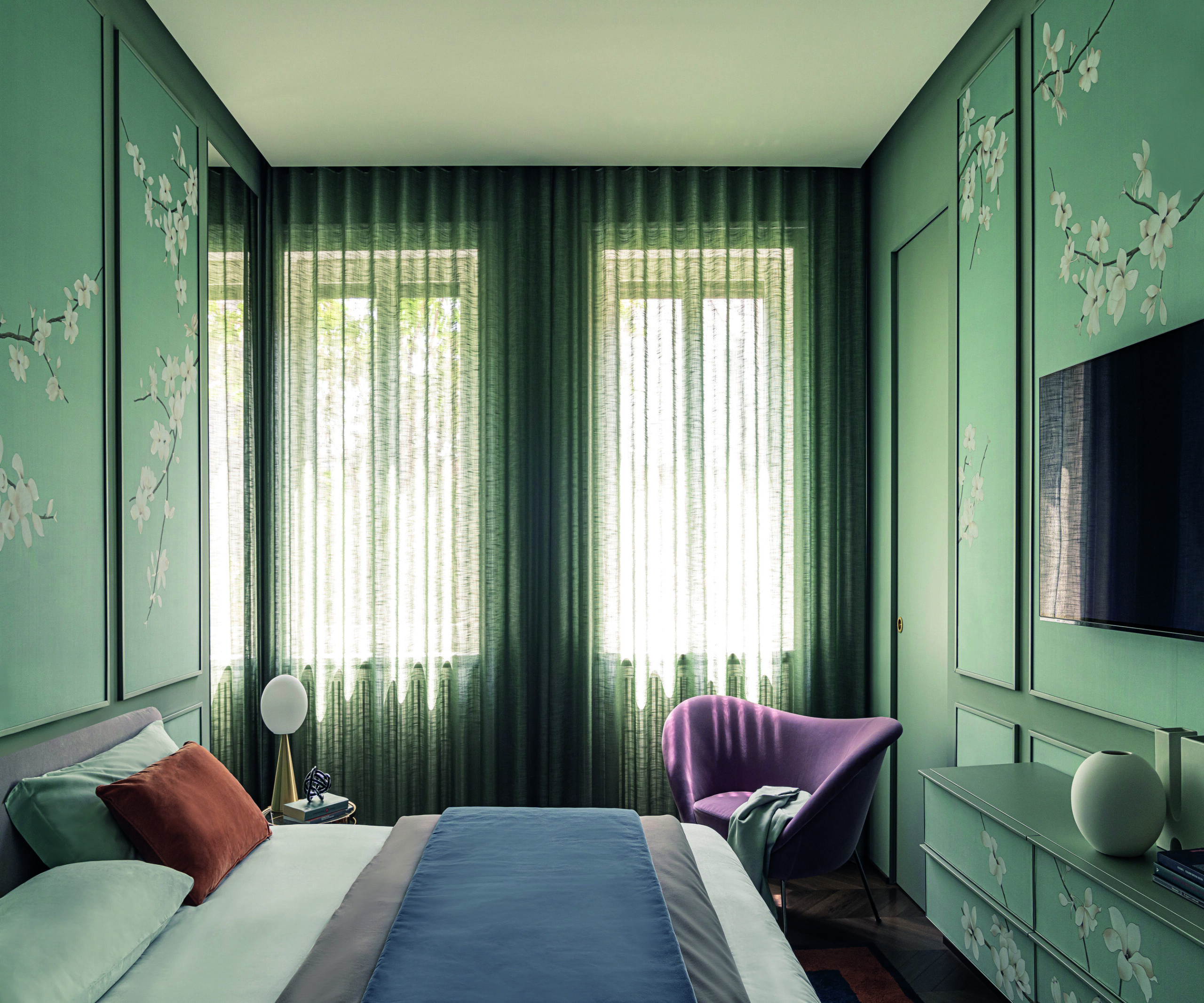
The owner, Luisa Galbiati, who works in the fashion industry, was eager to give her interior a feminine touch, but not stereotypically so. She had a vision of a cosy, intimate bedroom capable of creating a modern boudoir atmosphere. The walls were covered with hand-painted silk. “For the night zone, I opted for soft shades of green“. This covering, enamelled with a delicate cherry blossom motif, exudes that inimitable Japanese poetry. It cultivates a sense of tranquillity and well-being. The bed is swathed in a harmonious blend of pastel colours. The room is furnished with Gio Ponti’s D.154.2 armchair. This 1956 model, reissued by Molteni & C., was awarded the Compasso d’Oro this year. Alongside it is the Bilia lamp, also designed by this Milanese master for FontanaArte. Two icons of Italian design no less!
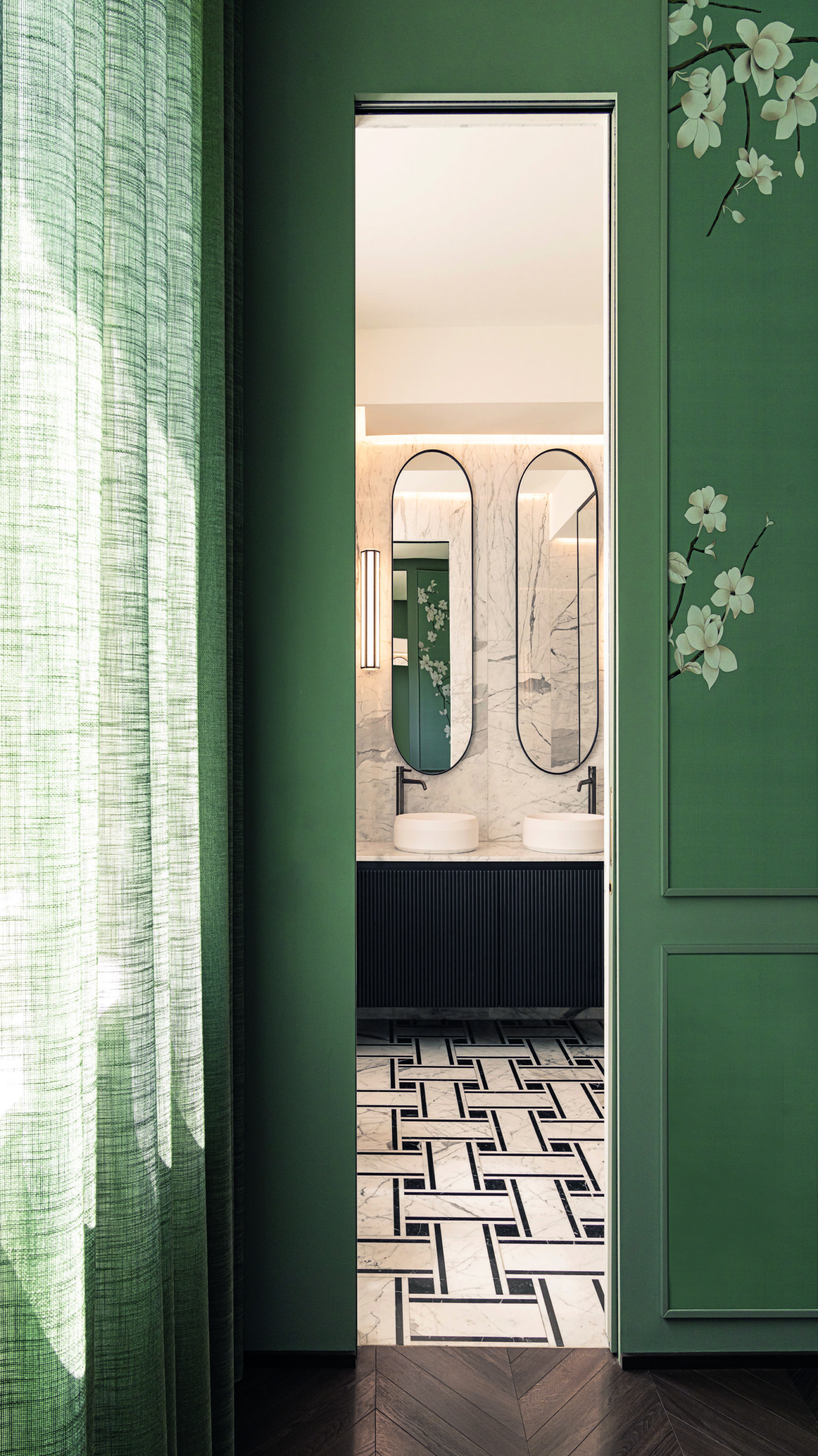
Bruno Tarsia is convinced that the project’s success is down to the meeting of minds between the architect and his client, both of whom share similar tastes: “My client trusted me completely. From the outset, we discussed our shared passion for noble materials and sophisticated colours. The apartment’s pre-existing layout was completely overhauled to create a new look, thought out to showcase the beauty and functionality of each space“.
His personal influences weighed heavily on the choice of colours: “I was inspired by nature to create a welcoming atmosphere. In all the living spaces, I kept a neutral base but added touches of brighter tones to create chromatic contrasts“. The presence of subtle shades of light gold, brass and bronze accents also help to infuse the place with an atmosphere of discreet luxury. What’s more, for the living room, Bruno Tarsia has designed a custom piece of furniture that takes the form of a wall featuring a vast painting that rises and falls to reveal and conceal the television.
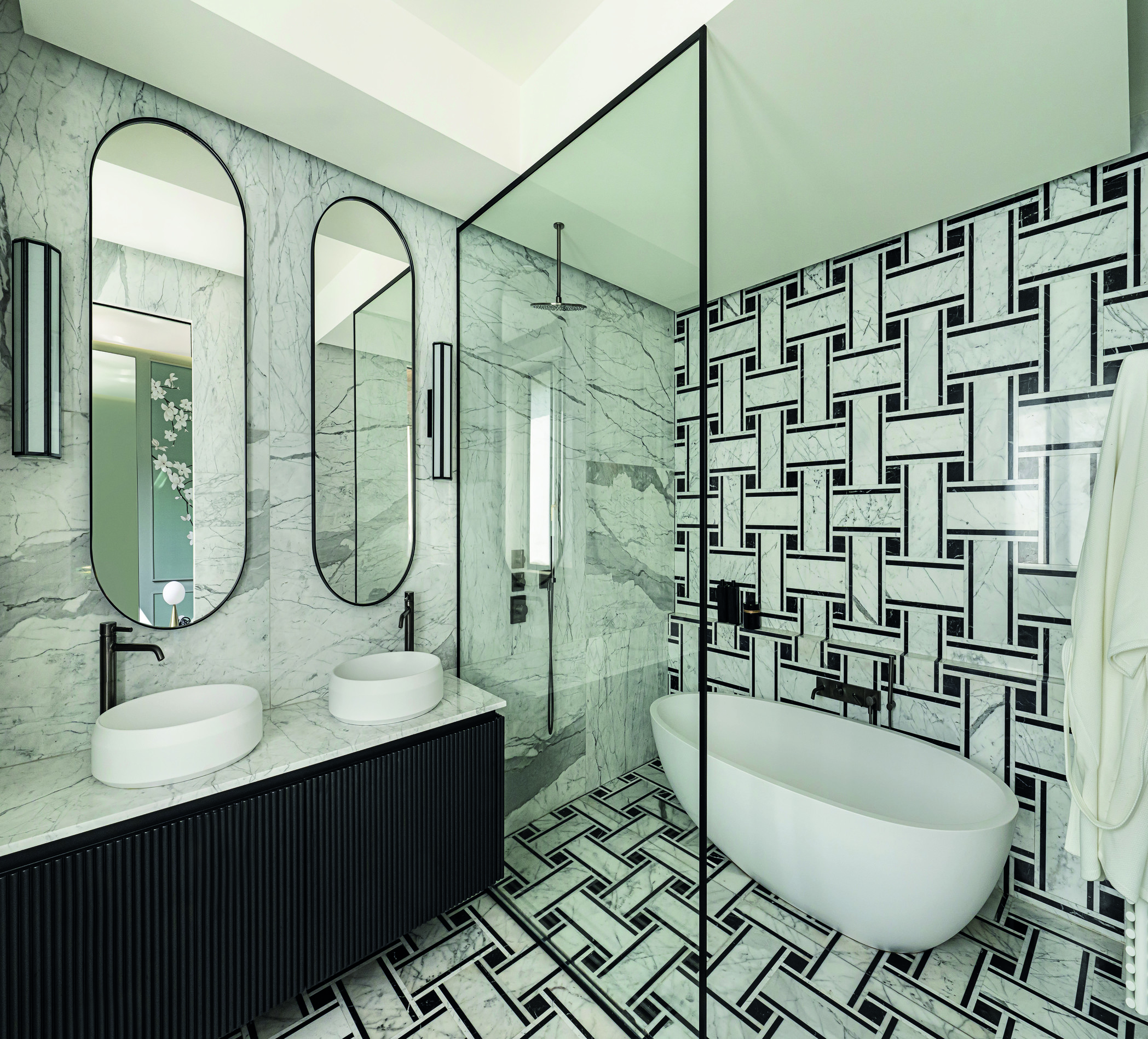
In this two hundred square metre apartment, the main bathroom plays on the contrasting notes of a black-and-white duet, decorated using geometric shapes featuring optical effects. The tile pattern was achieved by combining two Italian marbles: Nero Marquina and Blanco Carrara. The immaculate bathtub (the Spoon XL model by Agape) is matched with black brushed metal fittings (Pan by Zucchetti). The double-basin vanity unit (Lariana model, designed by Patricia Urquiola, Agape), with its relief-effect front covered with semicircular strips, was designed by the architect himself. As for the guest bathroom, it shines out like a jewel, entirely clad in amazonite stone in a breathtaking palette of shades of green. The centrepiece of this backdrop, in a tribute to the timeless beauty of nature, is a washbasin (the Bjhon model by Agape) designed by Angelo Mangiarotti in 1970 (brunotarsia.com).
