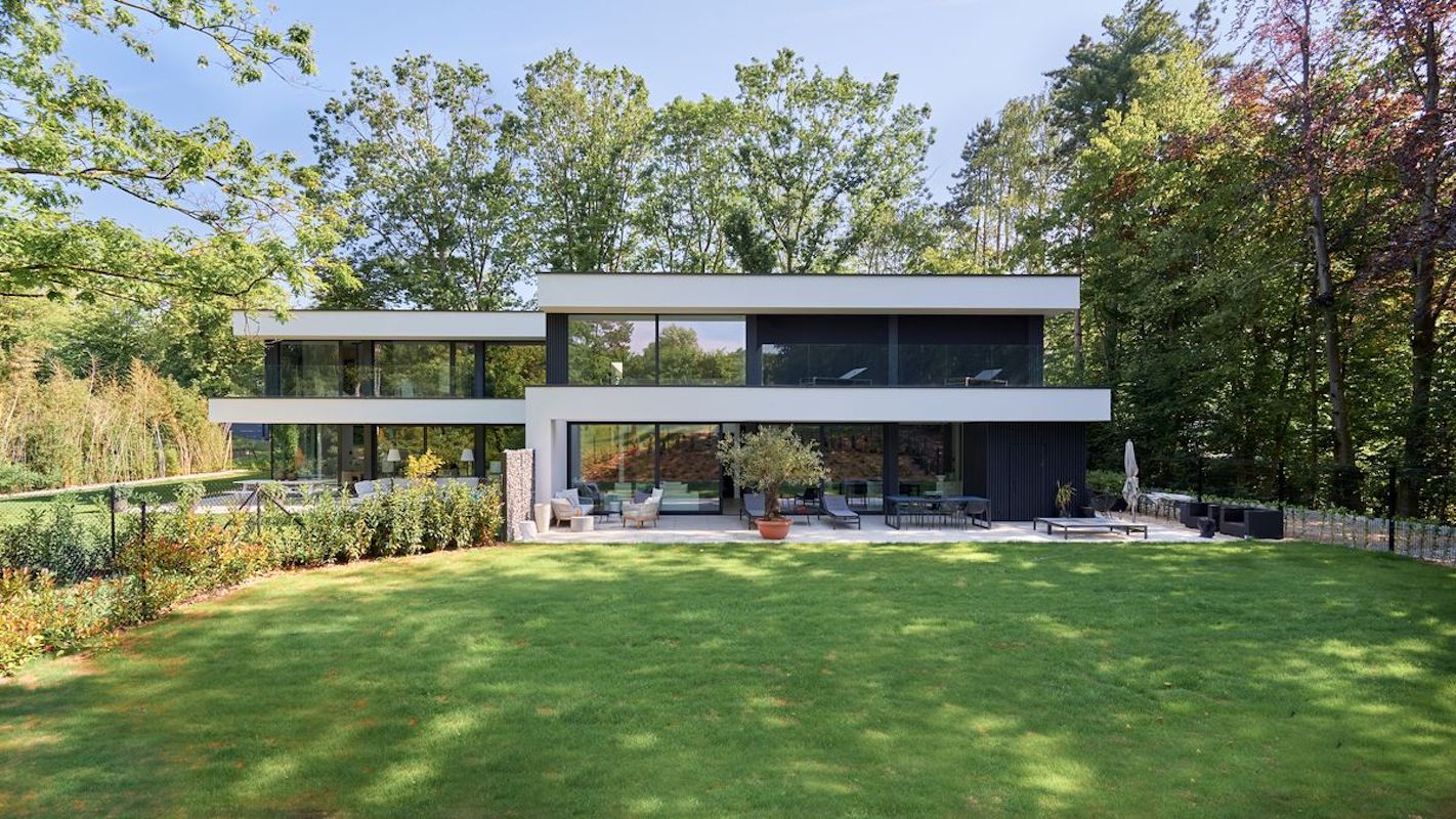
Each also has its own room with a double height that opens up the perspective and lets in the sunlight that illuminates the living spaces. The terraces on the first floor are intersected by gaps to allow light to reach the ground floor here too. Here, there are no walls touching the facades to avoid the separation effect and make circulation even more fluid. Light and open spaces are incorporated into the architecture to encourage fluidity and a sense of space. The vertically structured aluminium cladding, which requires virtually no maintenance compared to wood, also accentuates the horizontal nature of the facades, with alternating black and white.
Discover all the architectural firm’s projects Hervé Vanden Haute.


