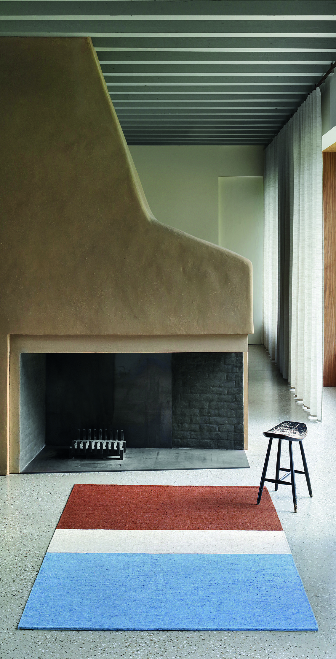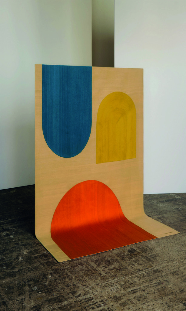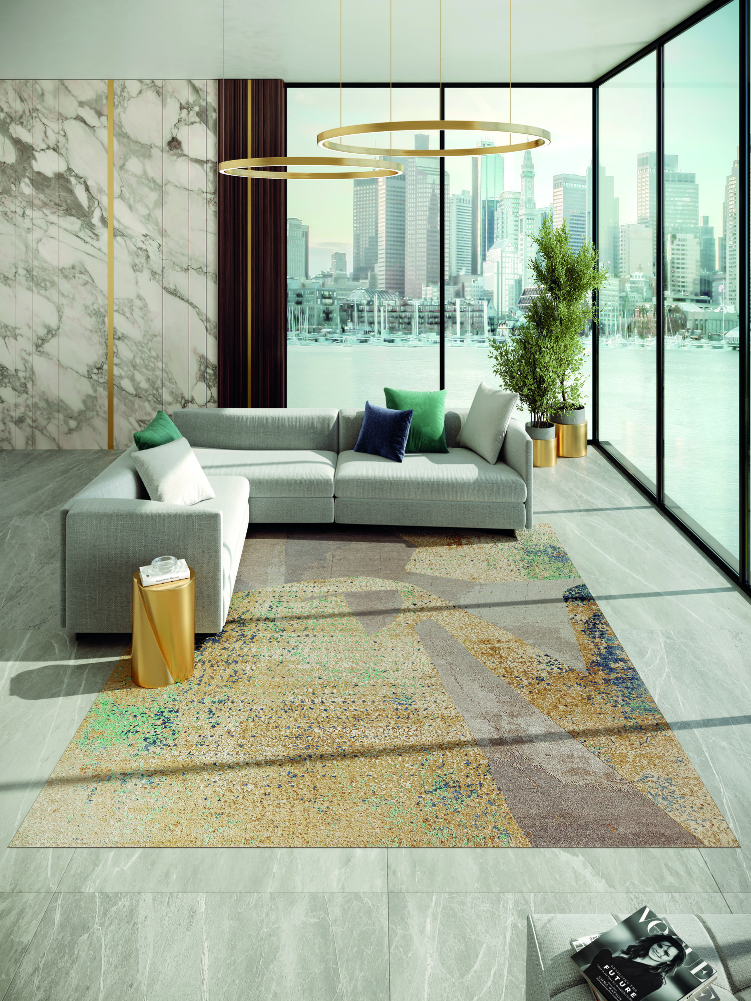
For more than two years, he searched for the perfect way to translate virtual architectural images into a series of rugs. The combination of geometric lines and abstract colour patterns gives the Spaces series its depth and flow. It is not only the volume effects, but also the use of high-quality, natural materials – like hand-spun wool and natural silk – that ensure that the rugs are perfectly on-trend.
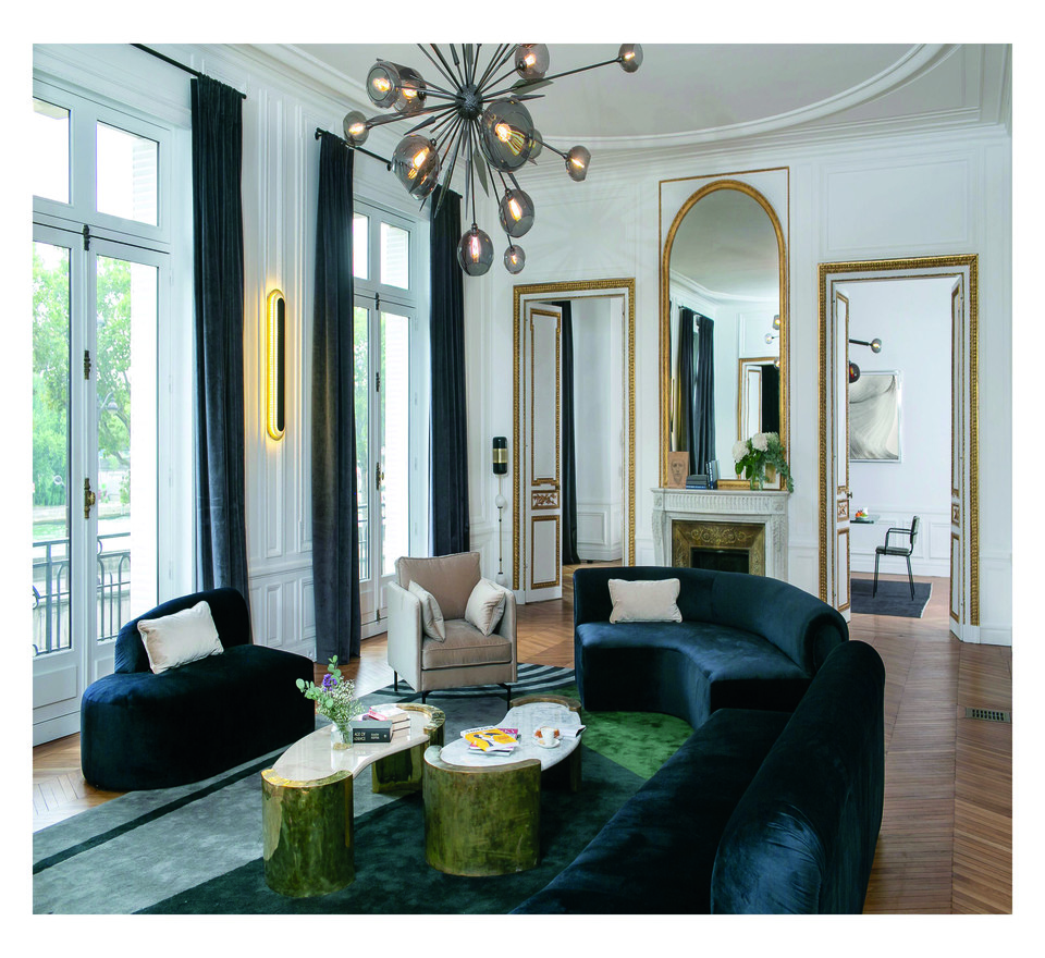
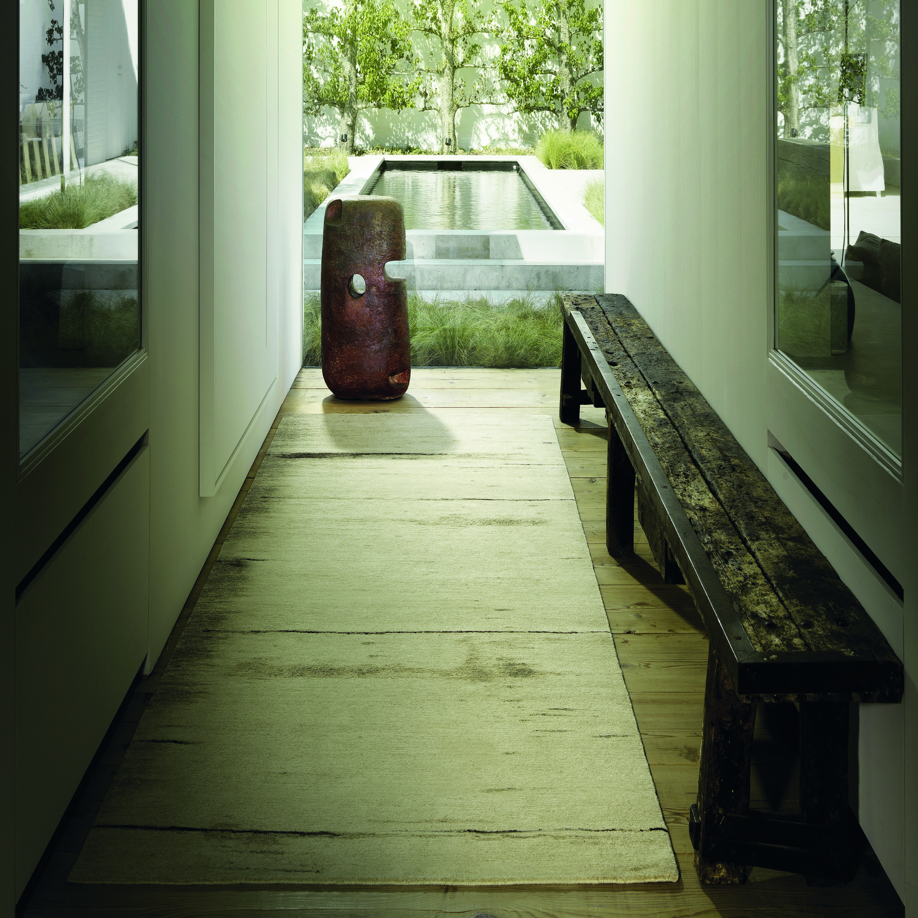
Quite a few other brands are similarly betting on natural colours and volumes. Belgian Van Caster, for instance, exclusively uses undyed Tibetan highland wool for its Missu collection. Brown, grey and white strands create subtle colour transitions. A delicate interplay of volumes is the DNA of the Oblique series designed by Brit Matthew Hilton for Spain’s Nanimarquina. Apart from these neutral shades, greens and blues continue to do well. A striking newcomer at the latest furniture fairs is rust, as evidenced by this Cassis by Classicon. The rug’s design is based on a gouache created by Eileen Gray in the 1920s.
![]()
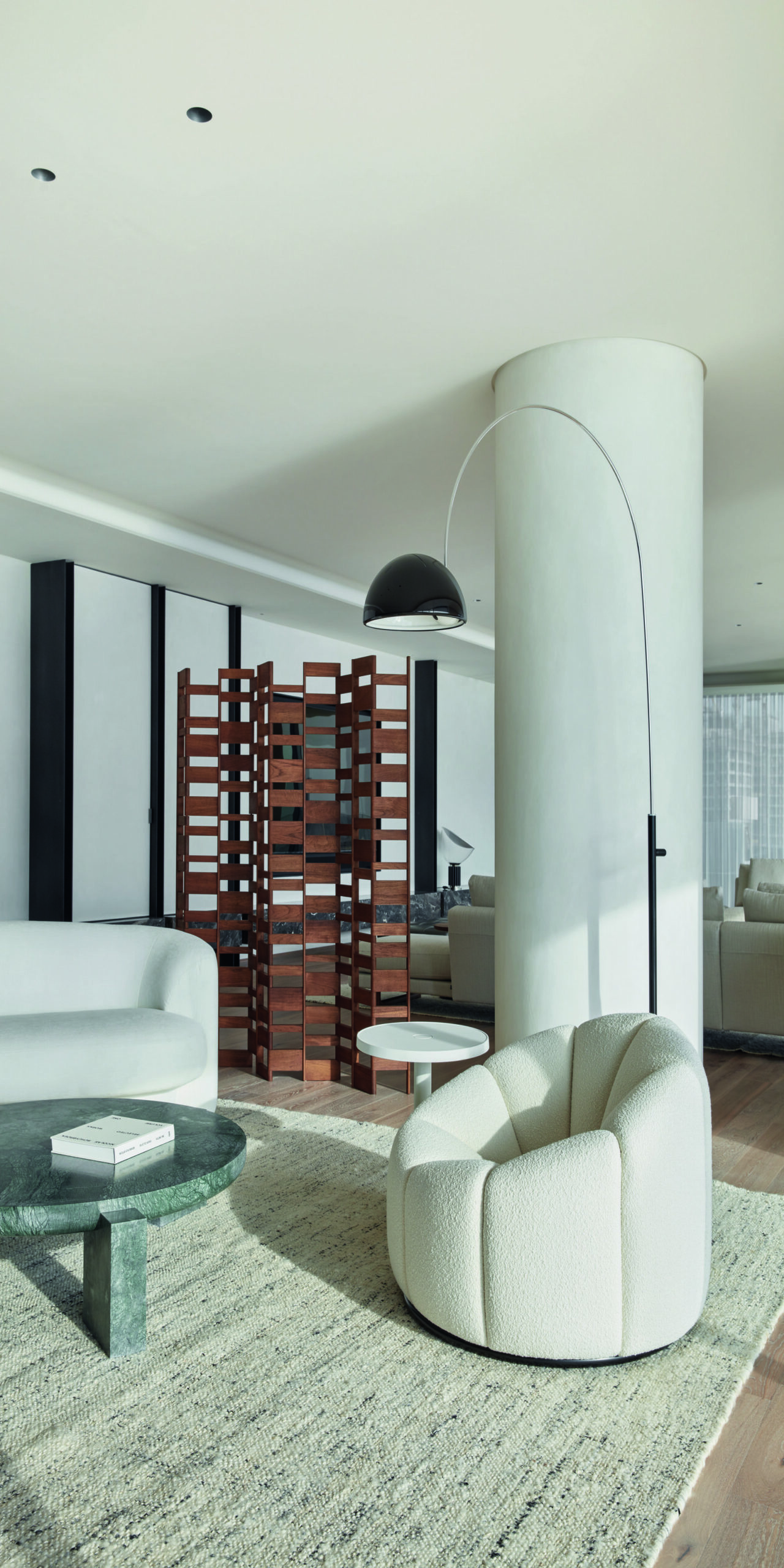
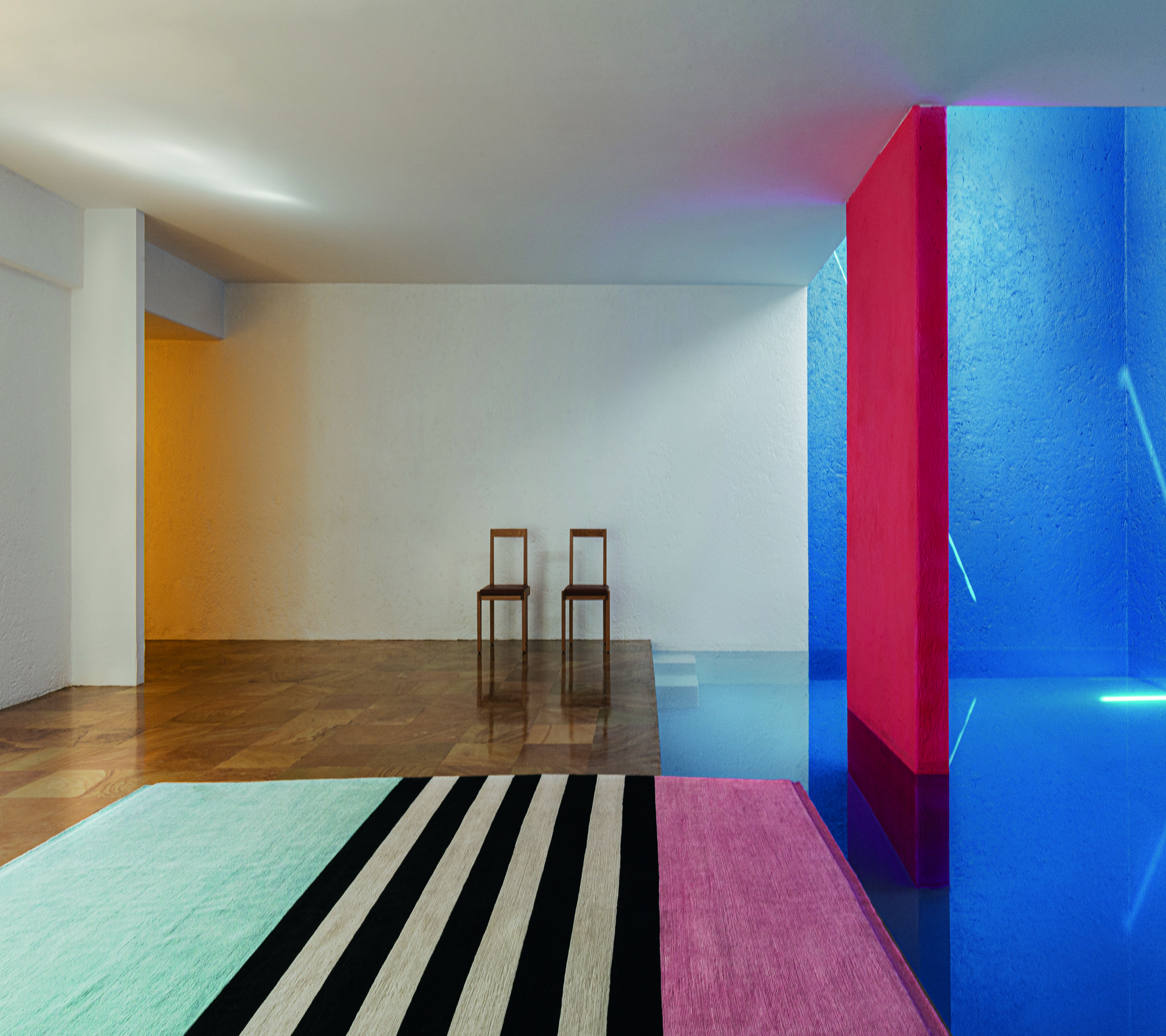
Geometry and colour remain in fashion and timeless, too. Italian cc-tapis, for instance, recently released Charlotte Perriand’s Les Arcs collection, despite the design dating back to 1972. In contrast, for years Belgian designers Cathérine Biasino and Marie Mees have steadily built their powerful collections with The Alfred Collection. For Hermès, Pierre Charpin elected to play with pared-down shapes and stunning colours – perfect for a balanced statement on the floor.
